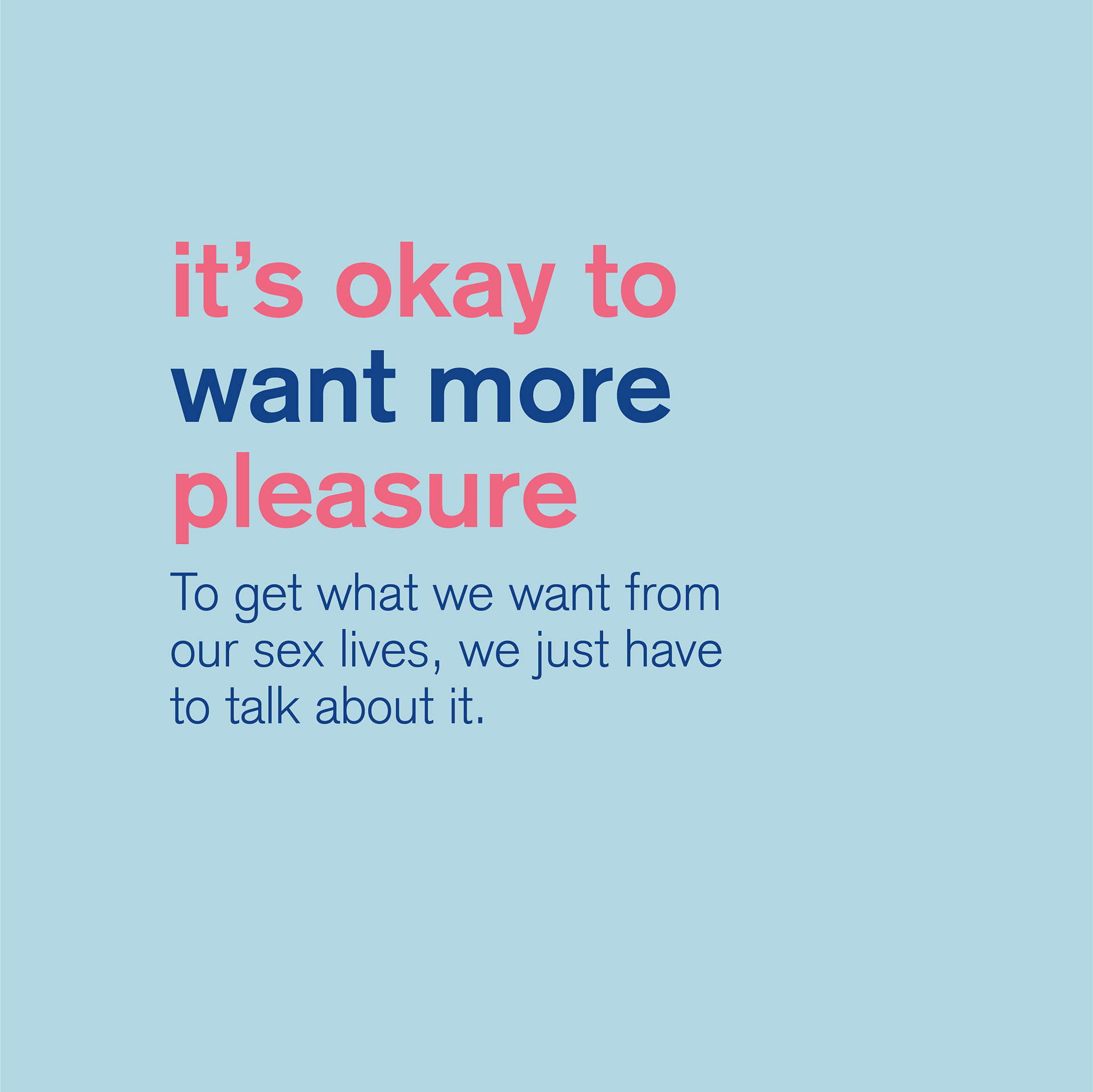
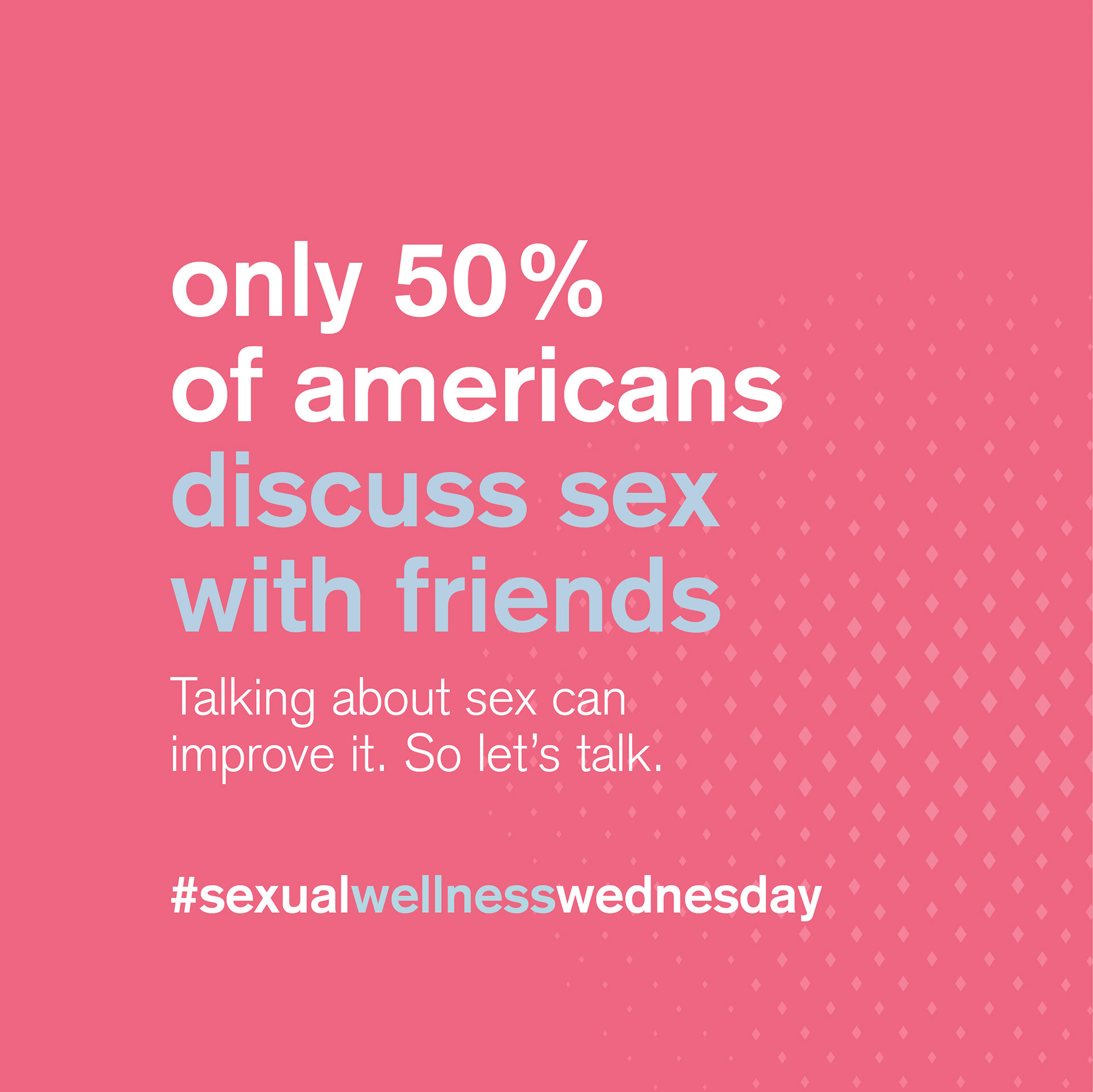
K-Y has been a leading expert in sexual health and wellness for women since 1904. With new research that discovered that women are having more painful and less pleasurable sex than men on average, K-Y saw an opportunity to rebrand itself to empower a new generation of women.
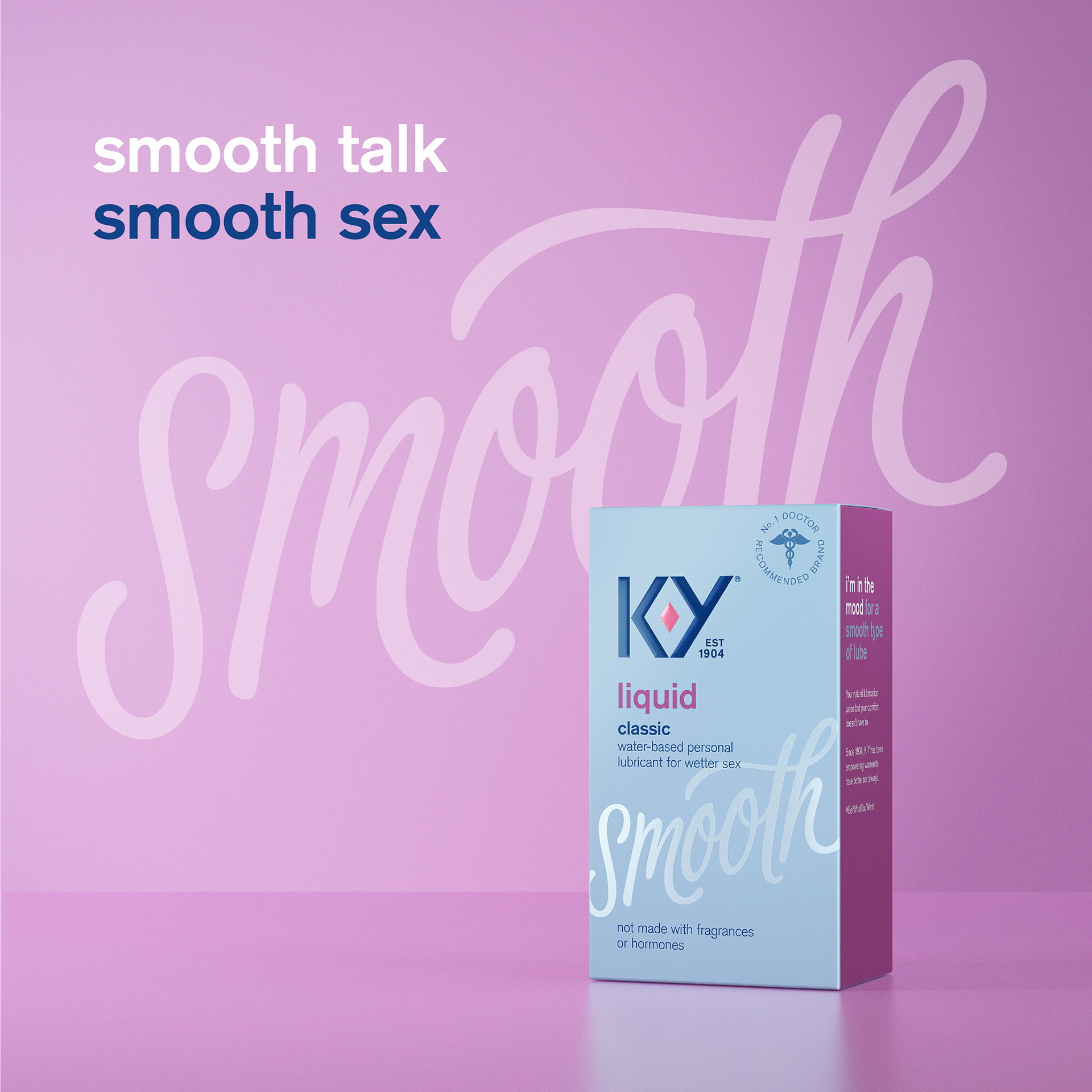
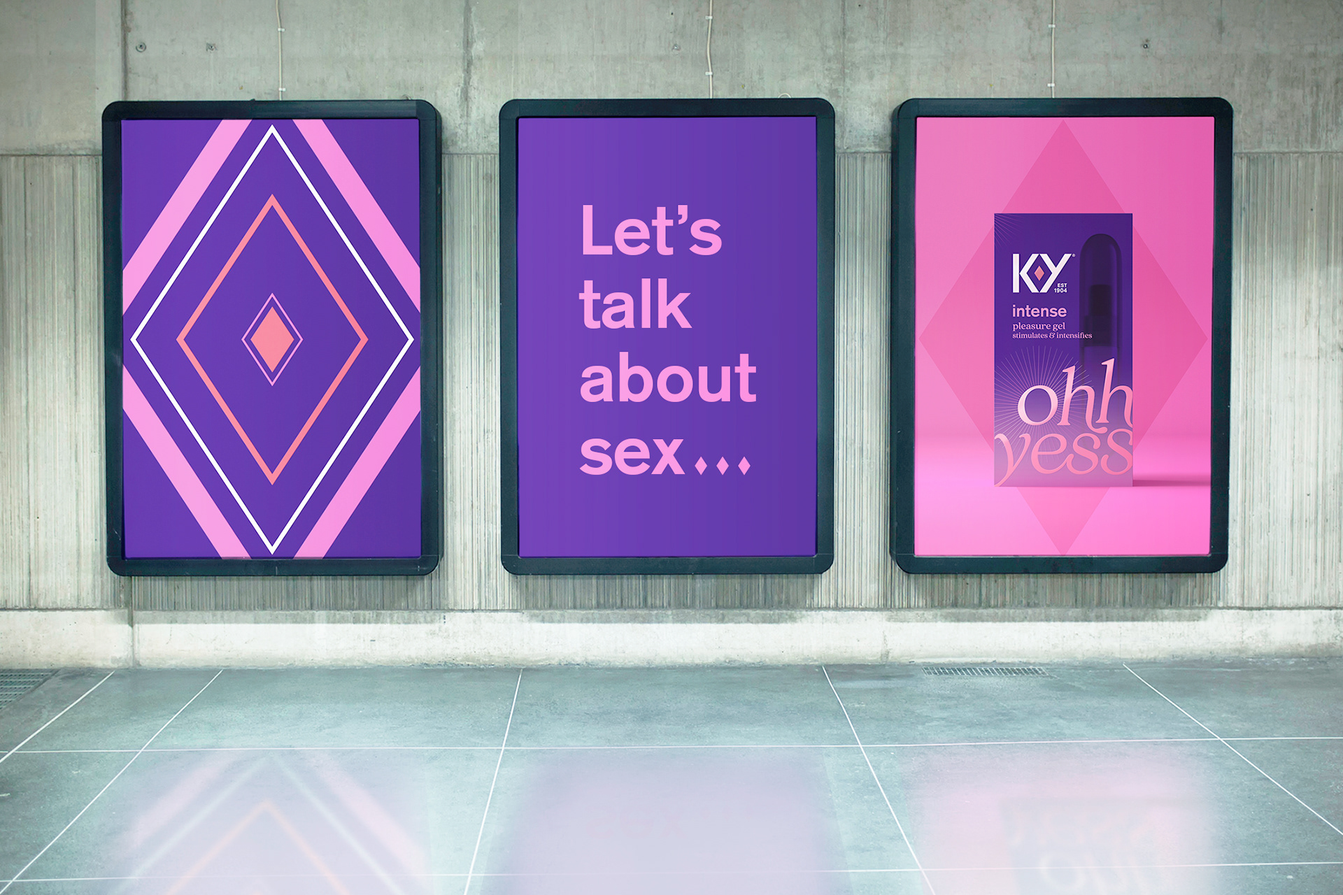
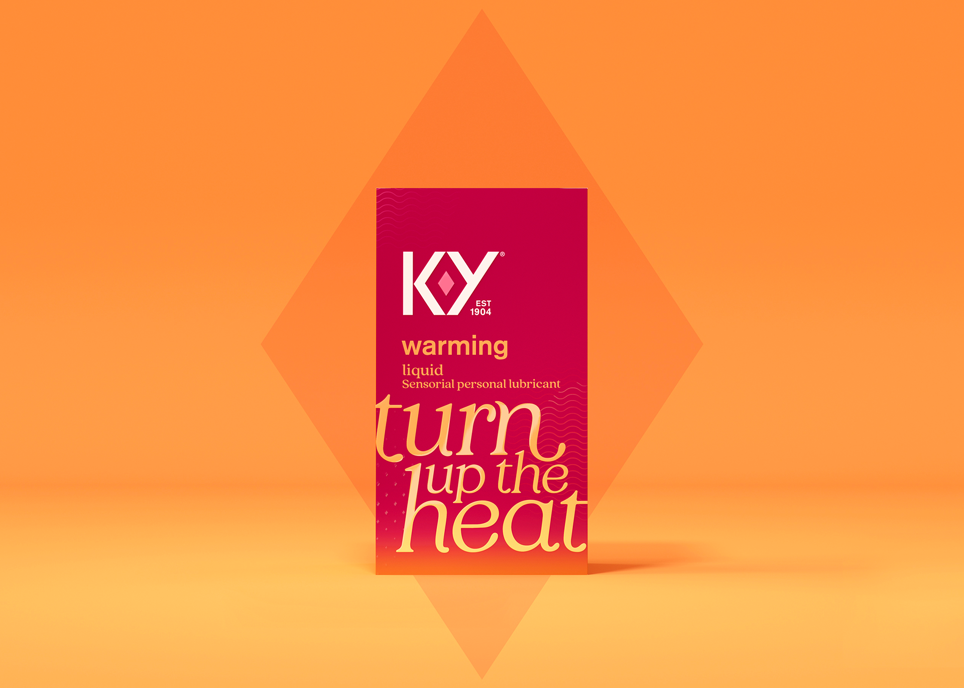
The new look and feel for K-Y were inspired by empowering women to have better sex always by talking honestly and openly about it. We used handcrafted typography to evoke pleasure and help people navigate across K-Y's large portfolio of products. The result was a revolutionary rebrand that still feels familiar, capturing the attention of loyal and new consumers alike.
This work has been awarded the 2021 Award of Distinction at the PAC Global Leadership awards and was shortlisted for Transform North America and CreativePool awards.
Client
Reckitt
Role
Design, copywriting, brand architecture, guidelines, and brand development
Team
Sam Cutler, Creative Director
Jess Marie, Design Director
Katie Hasler, Senior Designer
Jacklyn Munck, Designer
Marko Hoedl, Senior Implementation Designer
James Morgan, Motion Director
Dan Forster, Lettering
Jess Marie, Design Director
Katie Hasler, Senior Designer
Jacklyn Munck, Designer
Marko Hoedl, Senior Implementation Designer
James Morgan, Motion Director
Dan Forster, Lettering
Press

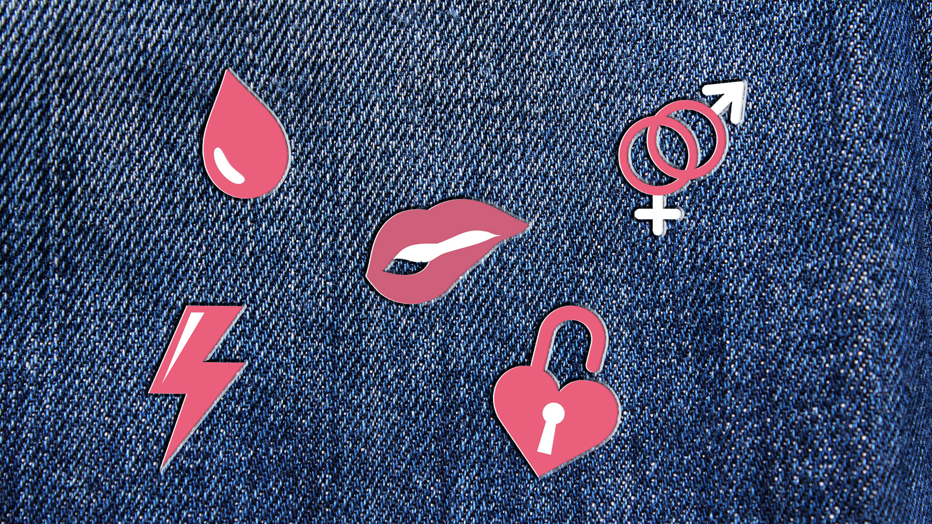
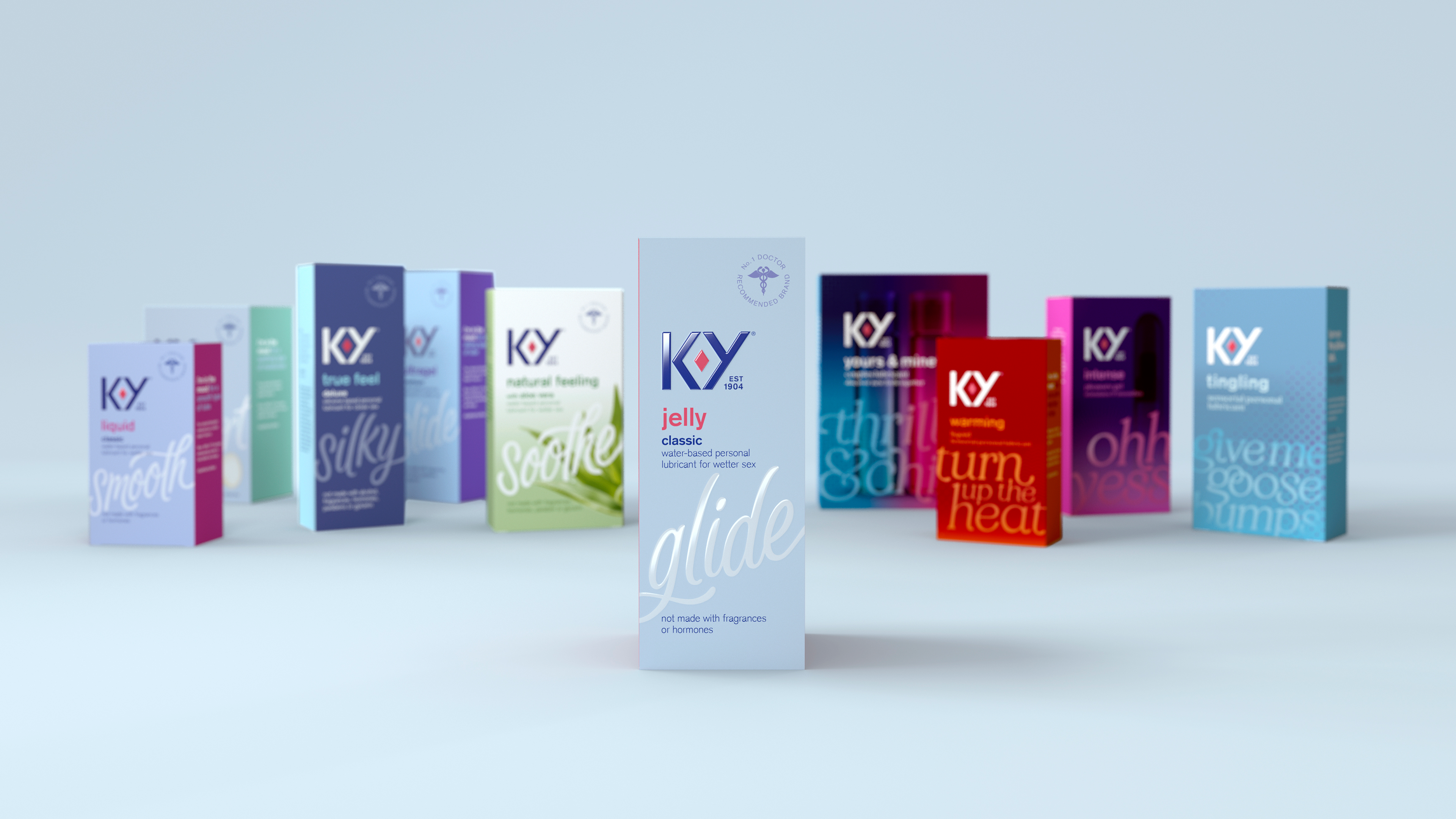
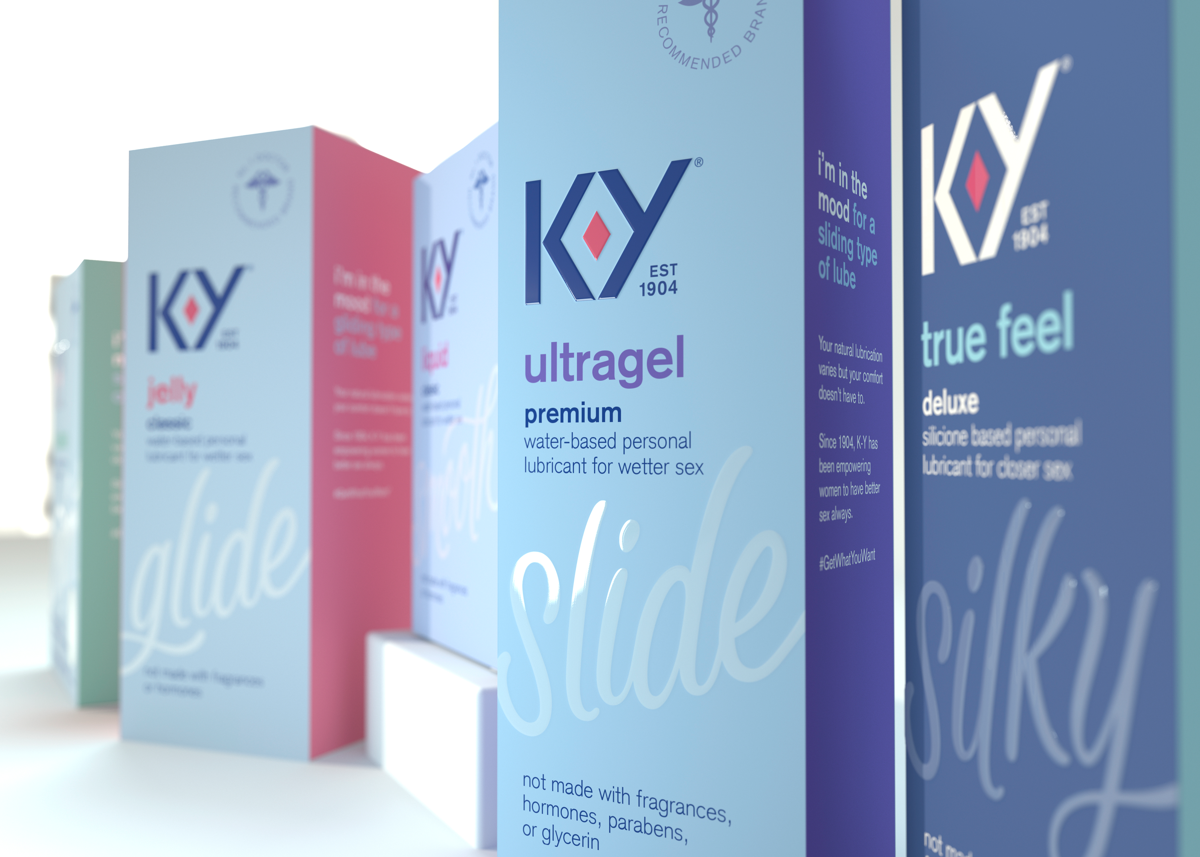
We refreshed the brand mark around the idea of the ruby— a symbol of uncompromising pleasure, quality, and the source of a woman’s sexual power and enjoyment. The ruby acts as a key brand asset and is used to create secondary graphics and key visuals.
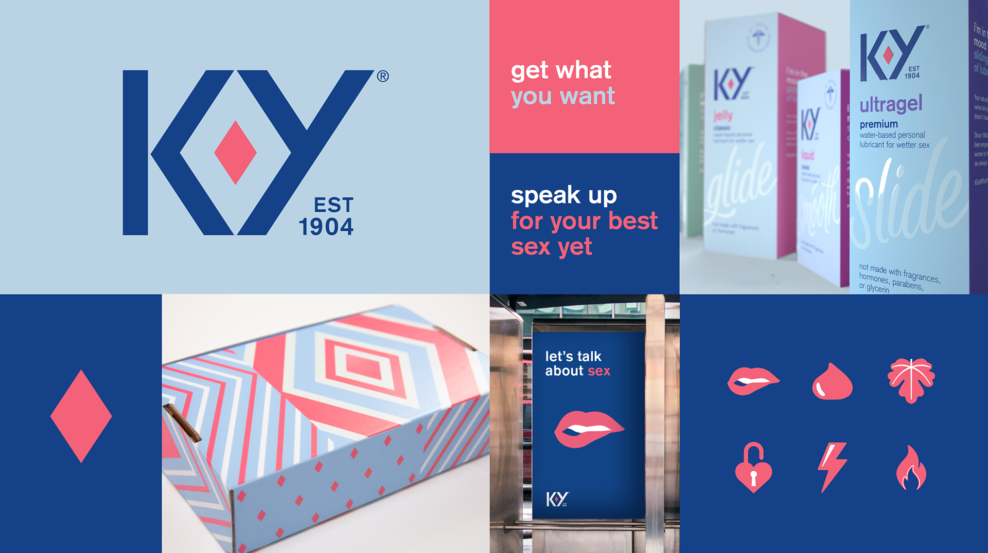
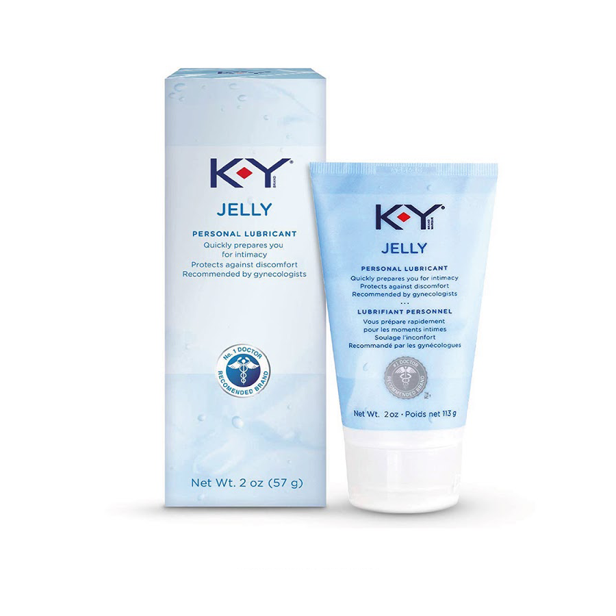
Our design and strategy teams organized K-Y's sporadically growing product portfolio into different distinct product ranges. From there, we developed customized lettering that brings a unique and ownable voice to each product. Each word or phrase has been handcrafted to illustrate the product experience or benefit.
For on and off-pack touchpoints, we developed a tone of voice that is sensual, informative, and conversational.


Using K-Y's newly-developed key brand assets and tone of voice, I helped to craft K-Y's brand world and designed its brand guidelines.